Weber Shandwick
Weber Shandwick was my agency training ground: big clients, layered approvals, fast timelines, and the kind of production details that teach you very quickly whether your file is actually ready. I worked across enterprise tech, healthcare, consumer, and corporate accounts, supporting brands that already had established systems, stakeholders, and many, many opinions.
The work here spans clients like IBM, Kaiser Permanente, VMware, Zinus, and more. It is where I learned how to design inside existing brand worlds, collaborate across disciplines, and make complex information feel cleaner than it started.
ROLE
Creative Intern → Junior Designer
TIMELINE
2017-2020
WHAT I WAS LEARNING
How to move quickly inside established brand systems, make complex information easier to understand, and keep the work clean through approvals, production, and handoff.
SCOPE
Enterprise design, infographics, print production, presentation design, event collateral, environmental graphics, social assets, campaign support
TEAM
Michelle Tang, Angela Mears (RIP 🤍), Juliet Fox, Bev Storrs
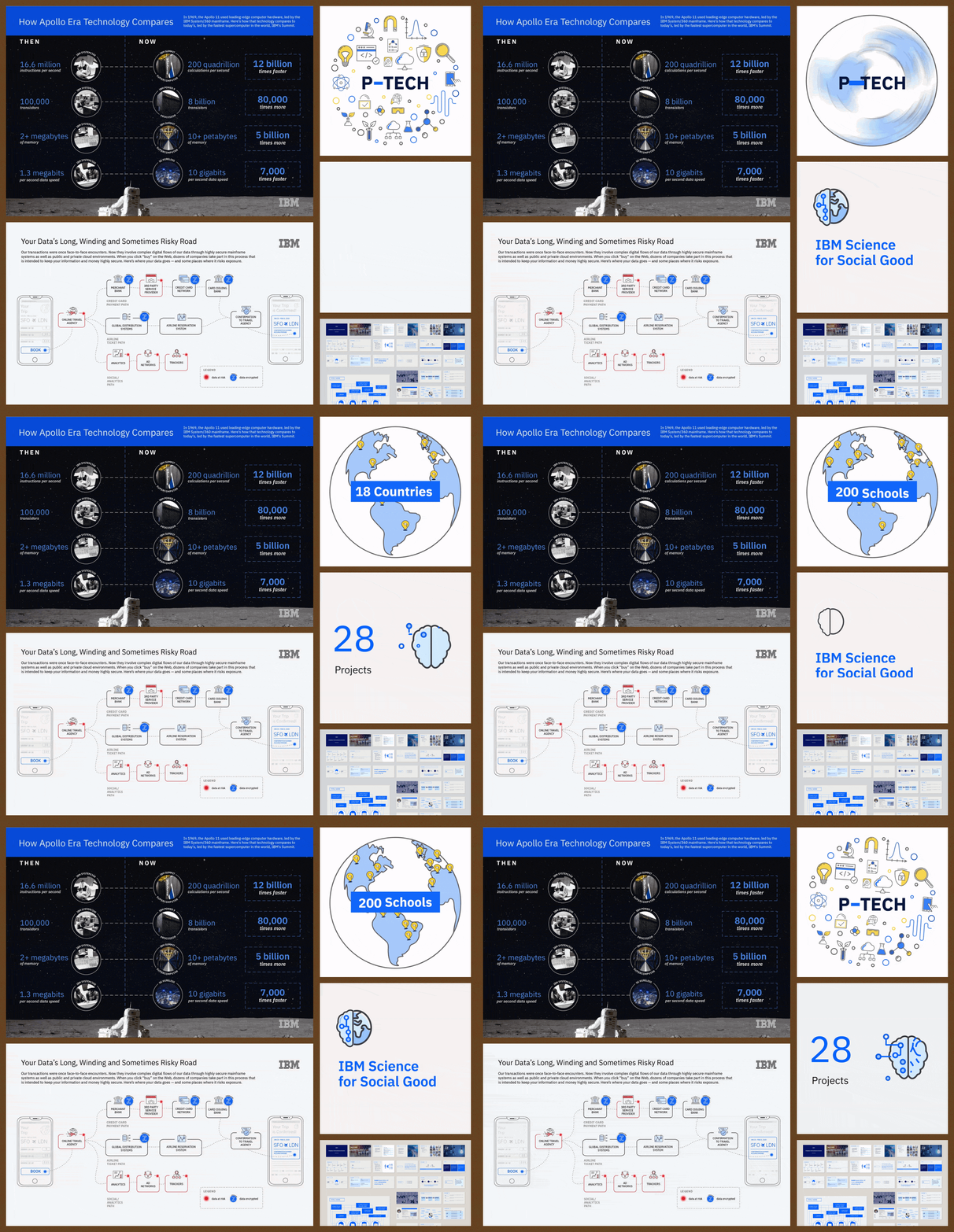
Big blue, big systems
IBM work meant designing inside a large, established system where clarity mattered and every detail had to behave. Projects ranged from infographics and pitch visuals to campaign and educational materials for technical subjects. This work helped me build a stronger information design muscle: how to simplify dense topics, respect an existing brand language, and make the final thing feel polished without overcomplicating it.
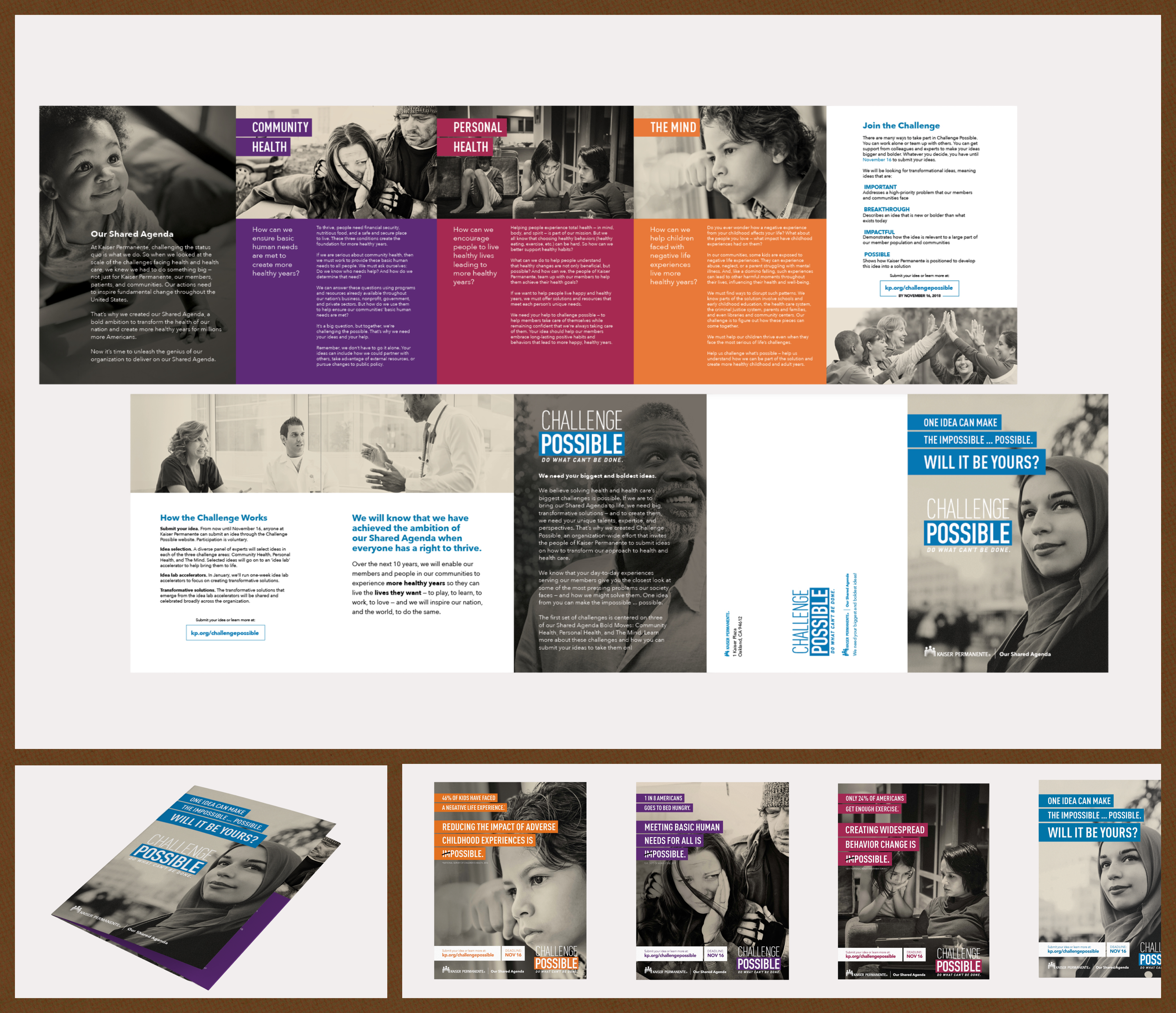
Specs, spreads, and deadline gremlins
The Kaiser work taught me how much design happens after the layout looks “done.” Print production, versioning, accessibility, file setup, and cross-functional review all mattered. I supported campaign and print materials that had to feel clear, accurate, and production-ready. It was a practical lesson in designing for the real world, where the final file has to survive printers, approvals, specs, and deadlines.
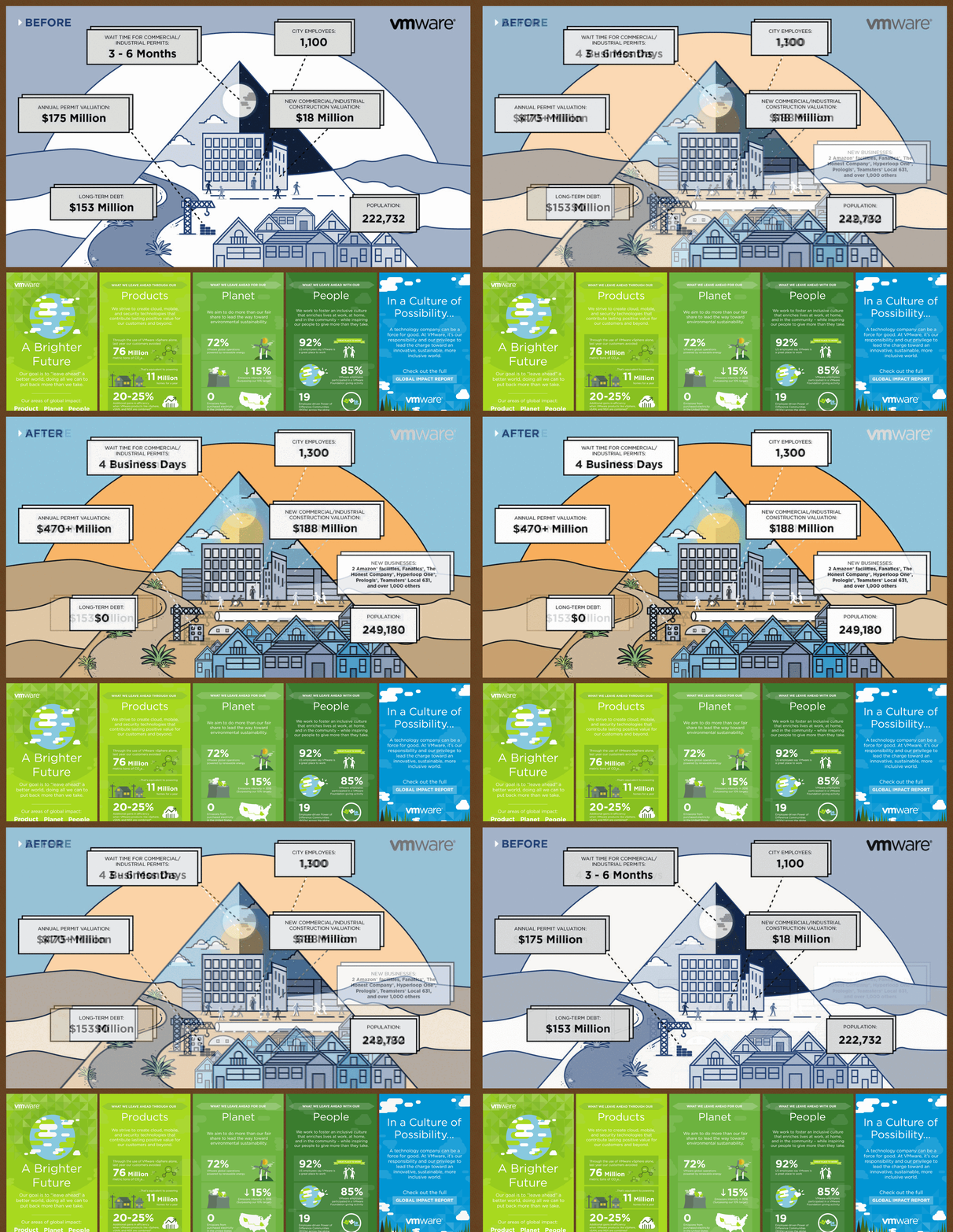
Making data a little less rude
VMware projects often involved technical information, research, and data-heavy stories. The challenge was turning dense material into visuals people could understand without stripping away the meaning. I worked on infographics and report-style visuals that used hierarchy, illustration, and layout to make complex information feel more navigable.
Designing for the BIG room
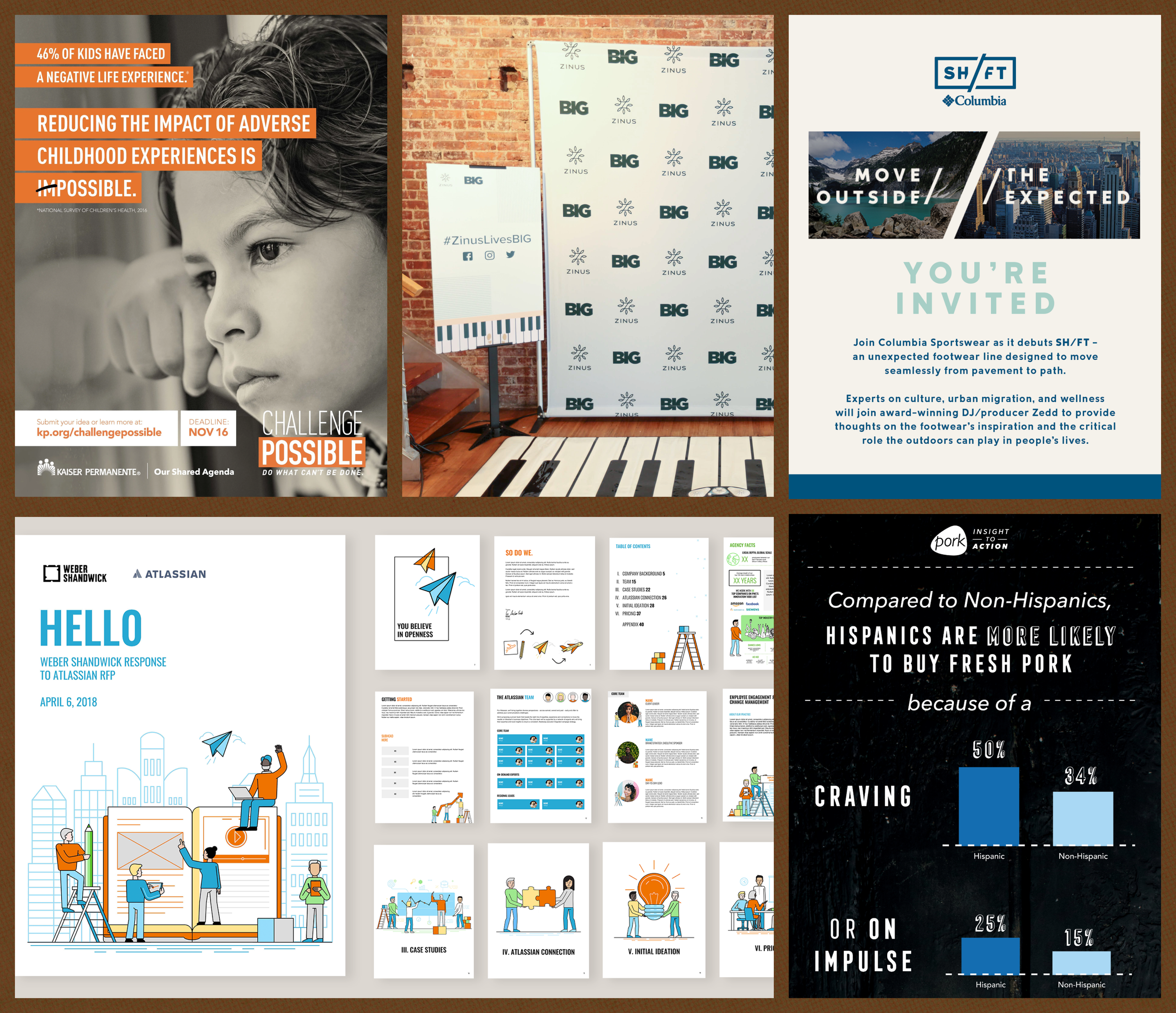
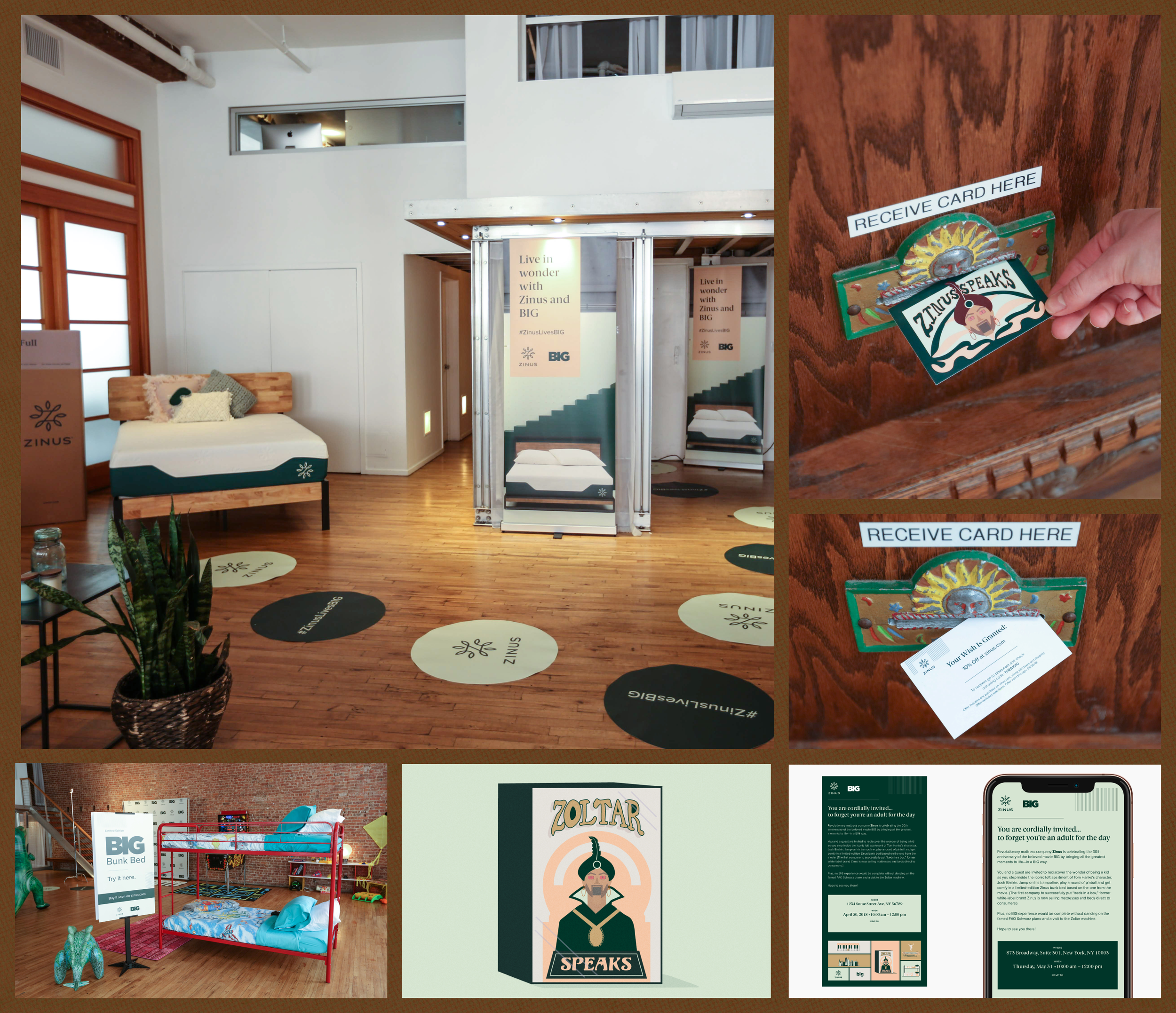
Zinus gave me early experience designing for a physical environment, not just a flat asset. The work had to consider space, movement, signage, attendee experience, and all the tiny touchpoints that make an event feel intentional. It was a different kind of design problem: less about one perfect graphic and more about how a brand shows up when people can walk through it.
✽ JUMP TO ✽
OYSTER ☻ LINDY ☻ WAND ☻ BLOOM FARMS☻ PLAYING AROUND