Oyster HR
Oyster is a global employment platform built for companies hiring distributed teams across borders. Its brand had to carry a lot at once: the optimism of remote work, the credibility required for compliance-heavy business decisions, and the clarity needed to explain payroll, benefits, and global hiring to multiple audiences.
As Brand Designer and later Brand Design Lead, I helped scale Oyster’s visual system across campaigns, web, editorial, presentations, internal communications, and executive-level company moments. My role was to translate complex asks into clear creative systems, protect brand consistency across fast-moving teams, and design work tied to measurable marketing impact.
ROLE
Brand Designer → SR Brand Designer → Brand Design Lead
TIMELINE
2021-2025
SELECTED IMPACT
✦ Webflow Awards finalist homepage work
✦ $1.3M+ ARR pipeline supported through campaign/editorial systems
✦ $400K+ closed-won connected to marketing initiatives
SCOPE
Brand systems, campaigns, web, editorial, sales enablement, presentations, internal communications, art direction, illustration, layout, QA
BRAND STUDIO TEAM
Justin Rands, Jason Yim, Natalie Harris, Ryan Kang, Richy McAllister, Michelle Kirk, Stephanie Huynh, Sudiksha Khanduja, Nneka Daly, Hibaaq Abdillah

The world is your Oyster: growing the brand
As Oyster grew, the brand had to stretch across more teams, channels, and business needs without turning into a pile of disconnected one-off assets. The challenge was building enough consistency for the brand to feel recognizable, while leaving enough flexibility for campaigns, content, web, sales, and internal teams to actually use it.
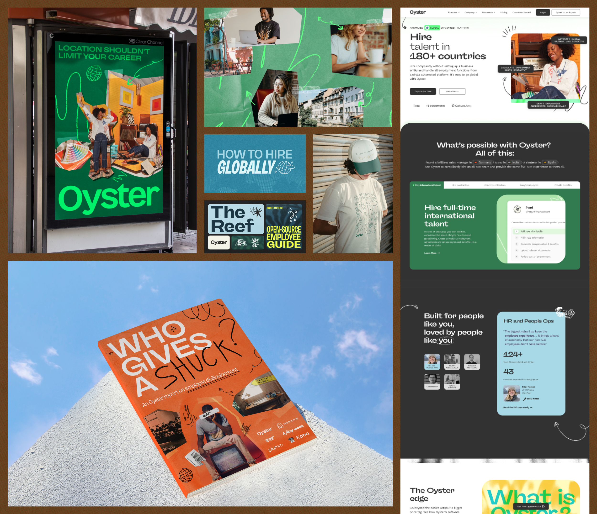
Wait, what exactly is a “distributed workforce?”
Oyster’s product lived in a complex space, so the design had to make global hiring, payroll, compliance, and distributed work feel easier to understand. A lot of the work came down to translation: turning dense business ideas into visual systems people could move through quickly.

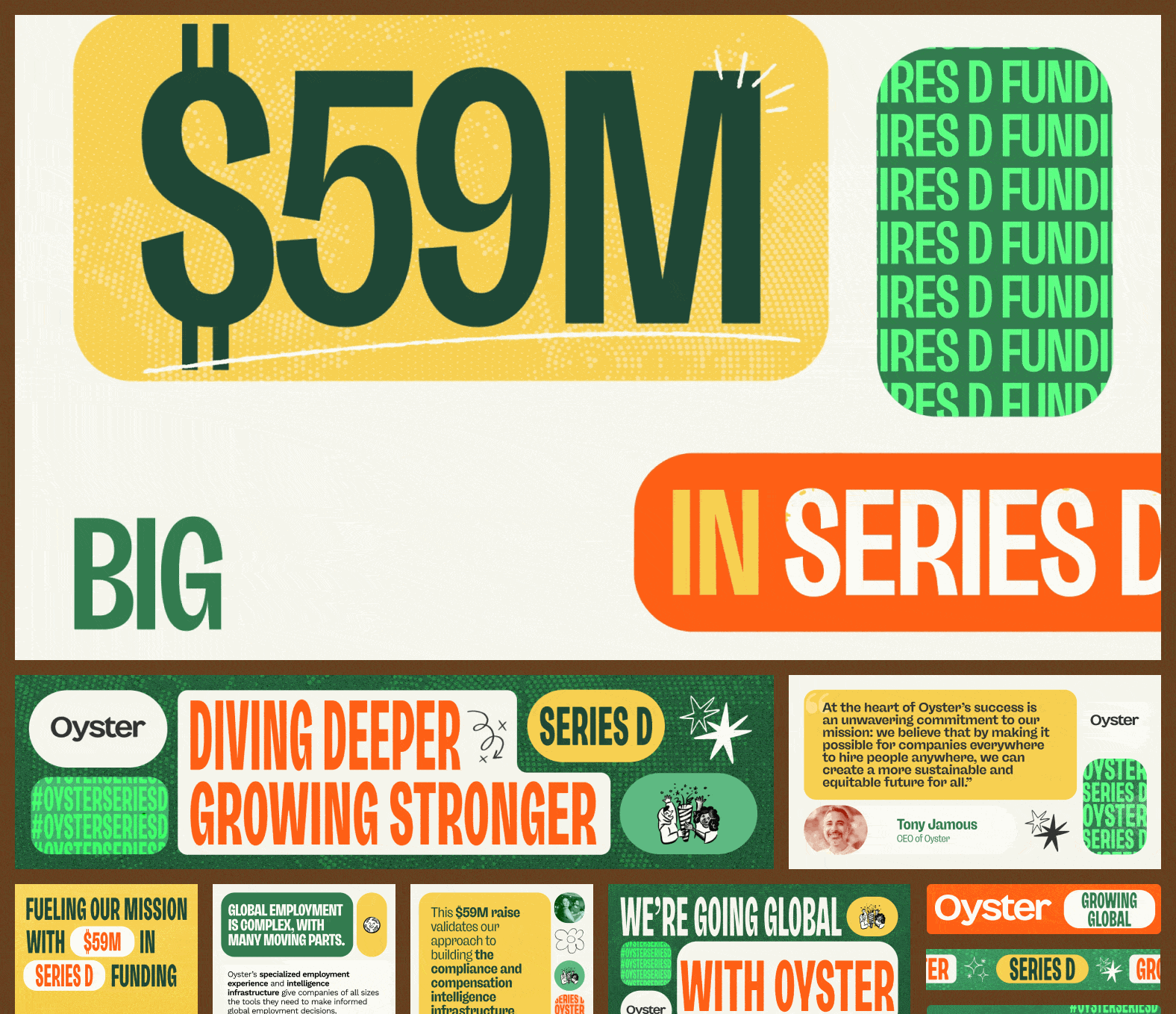
Making big waves and big news
High-visibility company milestones needed to feel celebratory and polished without drifting away from the credibility Oyster needed as a business-critical platform. For launch and announcement work, the design had to move quickly across social, executive, internal, and marketing channels while still feeling unmistakably Oyster.
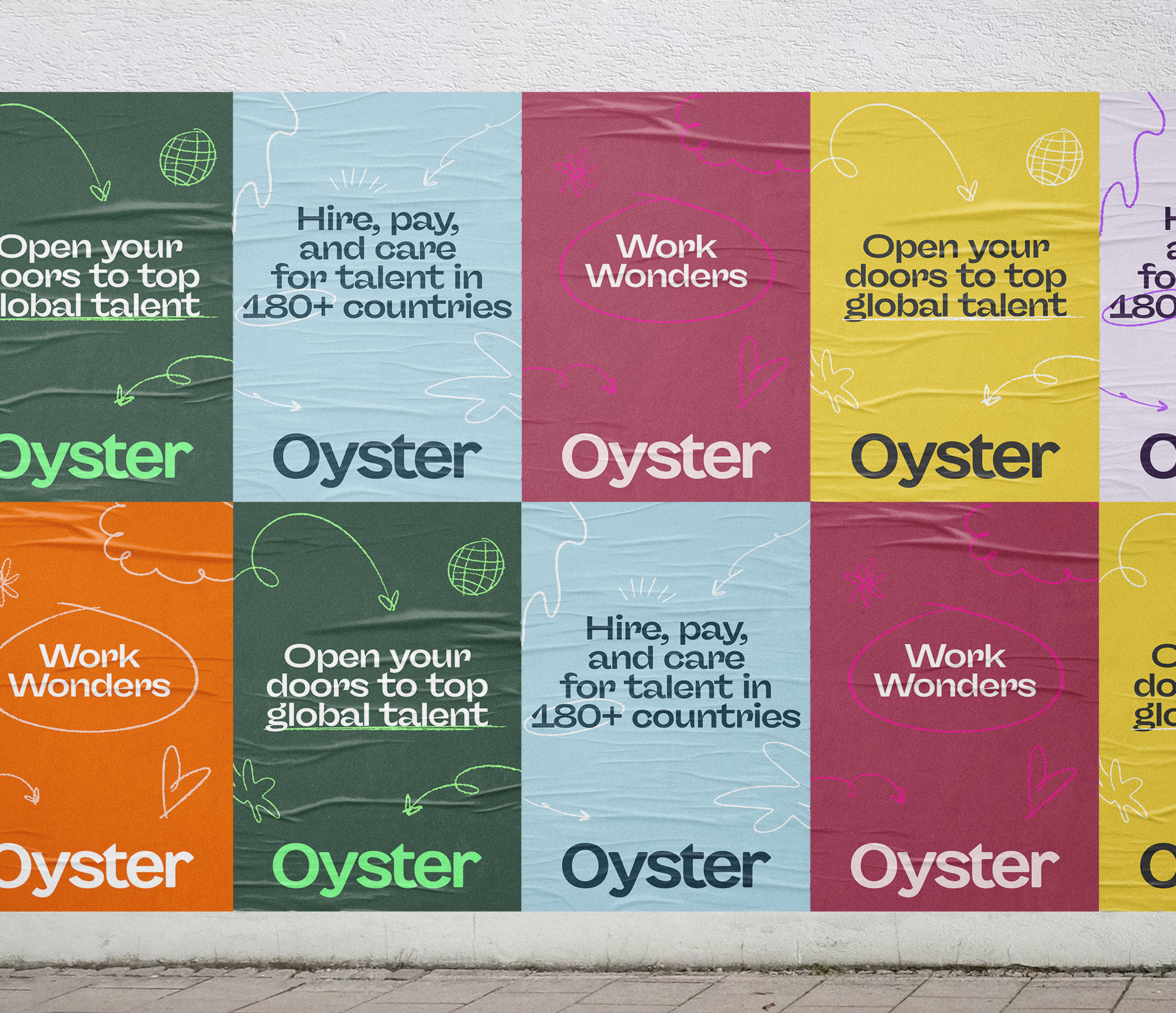
Building campaign systems that ship
Campaigns rarely needed just one asset, so the design system had to become a kit of parts that could travel across landing pages, ads, social, email, and sales materials. The most useful answer was usually a flexible visual system: clear enough to repeat, expressive enough to support the idea, and practical enough for teams to keep shipping.

The reef that keeps on giving
The behind-the-scenes pieces — templates, illustration rules, decks, and reusable assets — were what kept the brand from depending on one designer remembering every tiny decision. This was the less glamorous but deeply necessary work of building creative infrastructure teams could use without making the brand weird by accident.

✽ JUMP TO ✽