Bloom Farms
2020 - 2021 ✦ GRAPHIC & PACKAGING DESIGNER
Bloom Farms was my first in-house role and where I began shaping my voice as a brand designer.
Hired as a Graphic Designer, I worked across packaging, social, illustration, and anything else that needed design support. With a small team and a fast-moving, highly regulated industry, the work required creativity, adaptability, and a willingness to learn quickly.
This page highlights the more playful, illustrative side of my work at Bloom Farms. The projects that made cannabis feel approachable, educational, and human.
Team — April Carter Grant, Evan Thompson, James Mendaros
Brand Illustration ✦ Packaging & Print ✦ Merch & Apparel ✦ Sales & Retail Collateral
Product Illustrations
Illustration became a core part of how we communicated at Bloom Farms. It helped demystify cannabis, reduce stigma, and make education feel inviting rather than intimidating.
I created illustrations to introduce new strains, explain the anatomy of the plant, and support educational moments across sales and retail. These visuals were often used as posters, handouts, or social content and became a recognizable part of the brand.
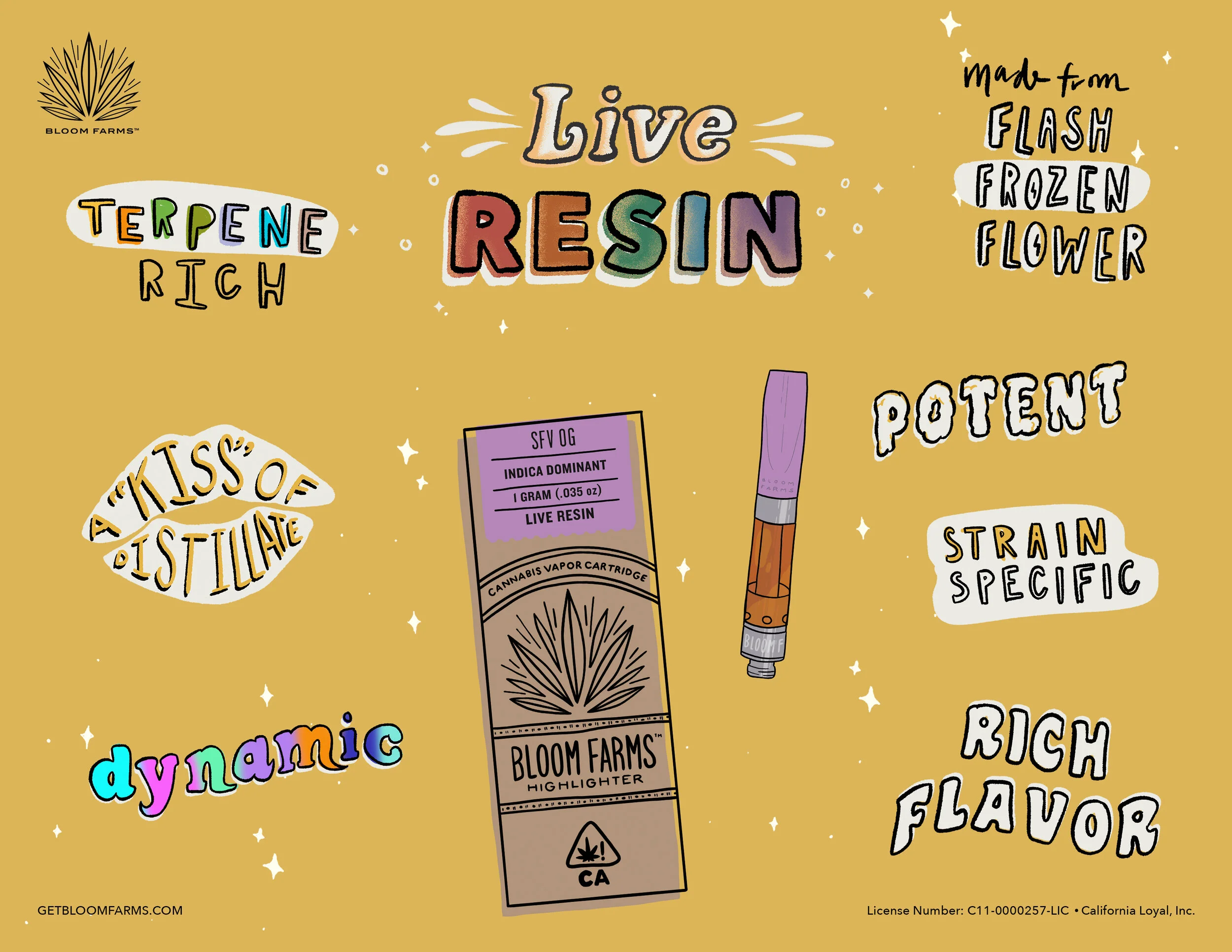


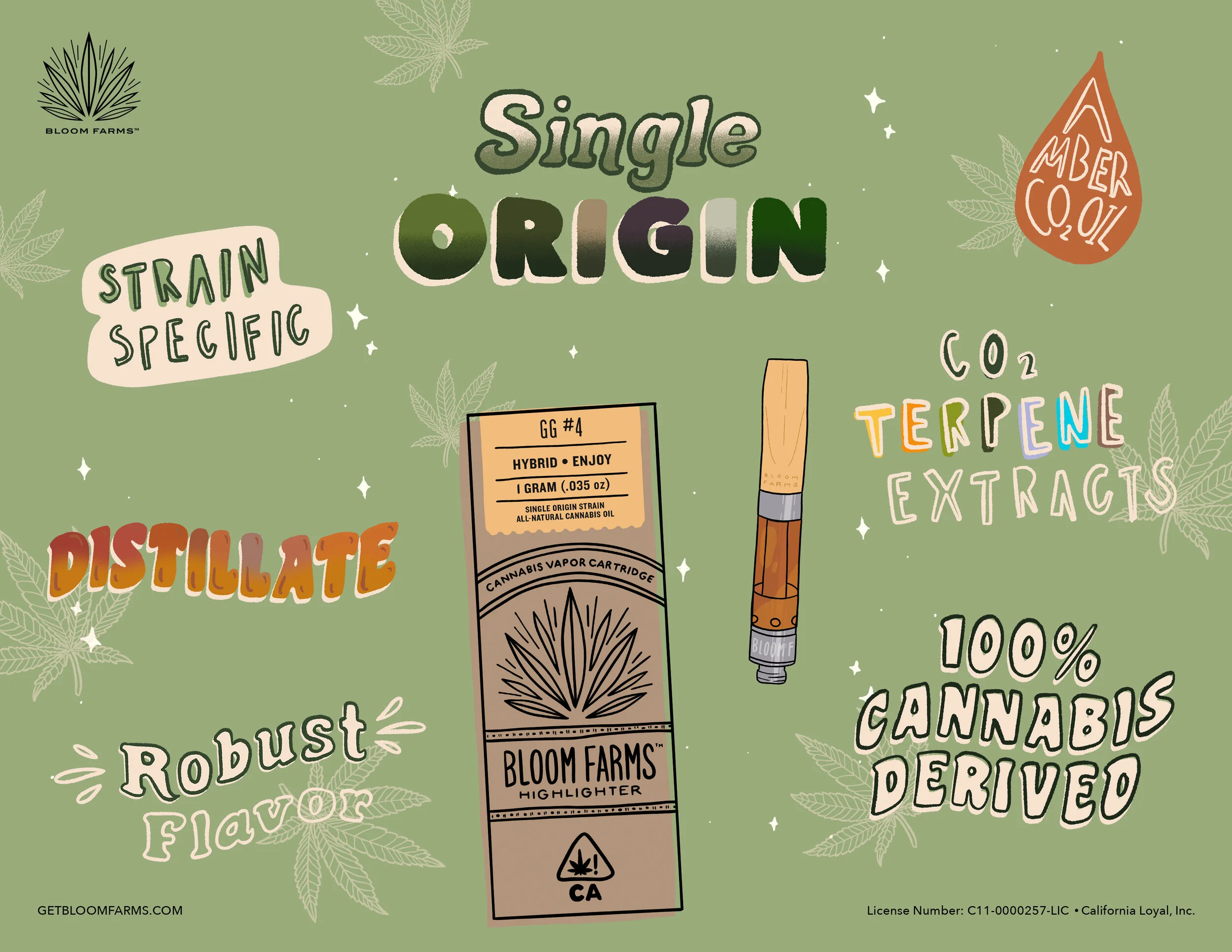

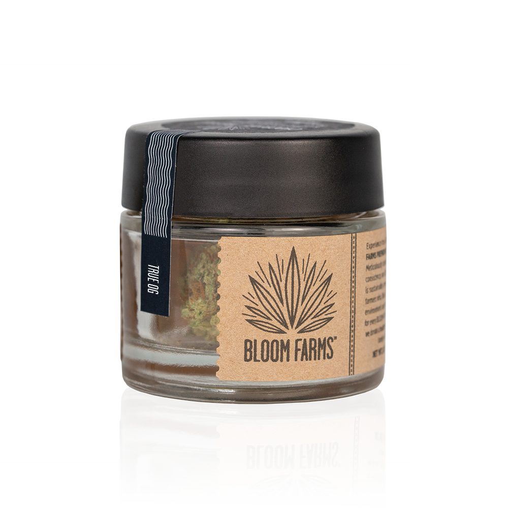
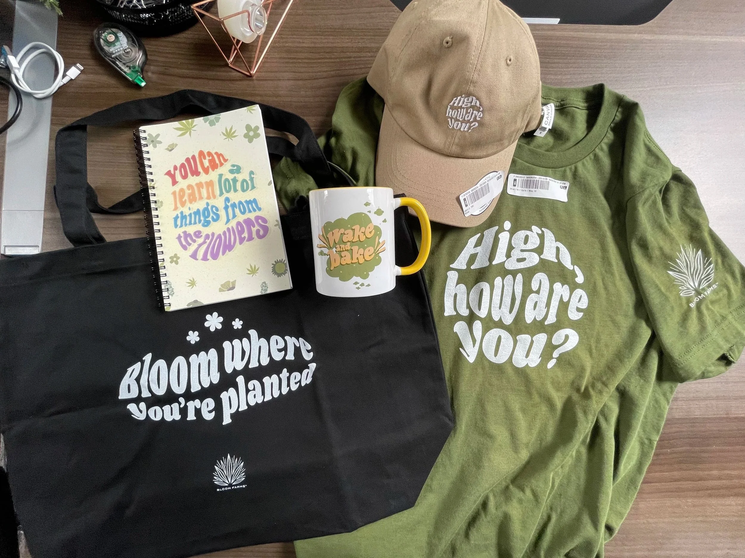
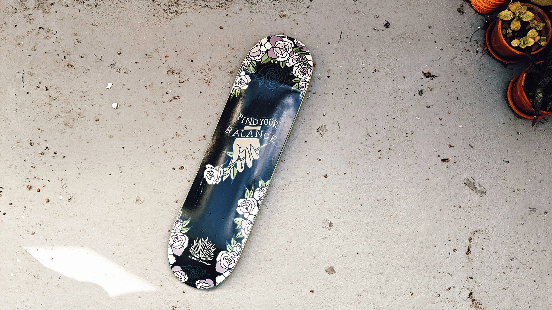
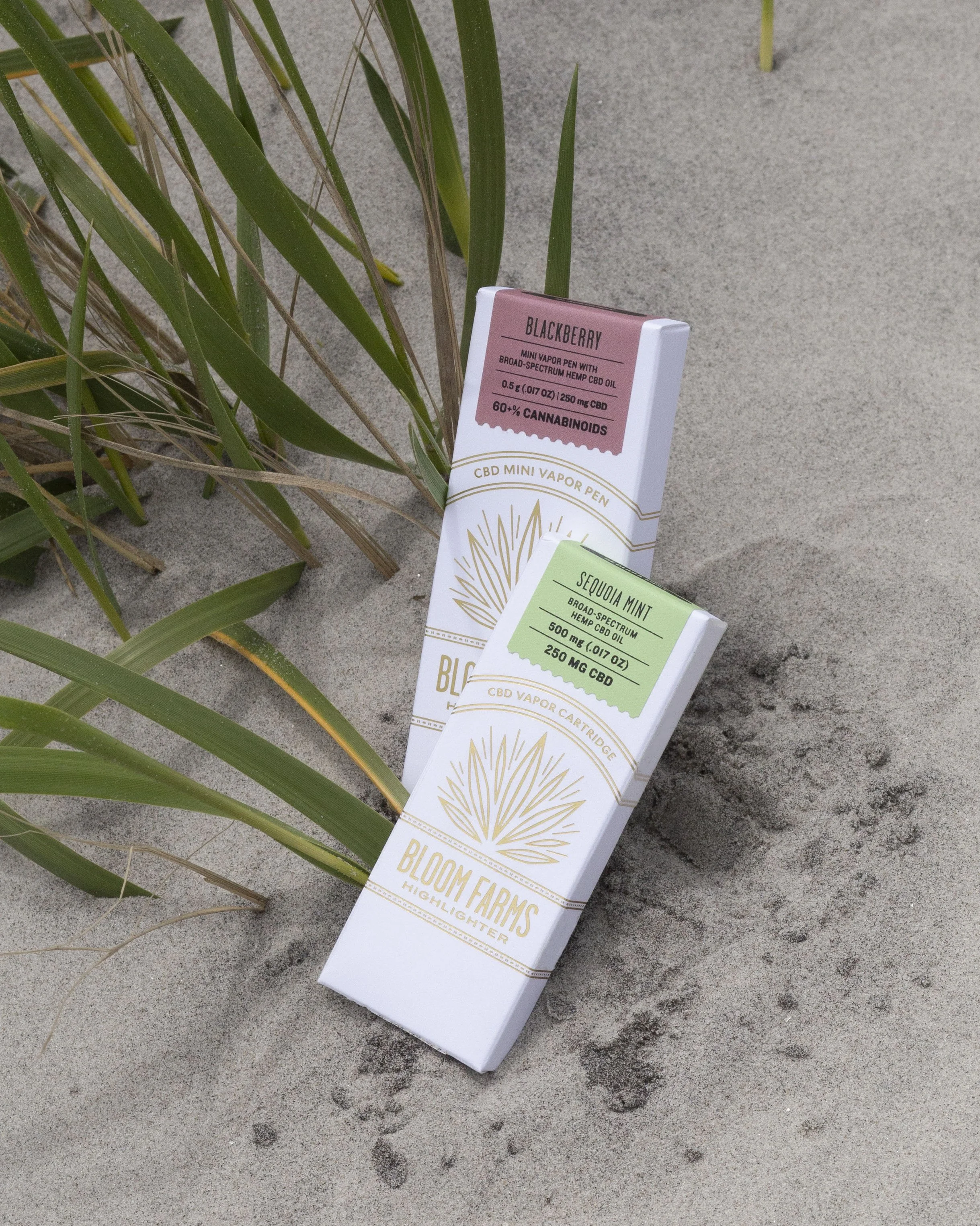
Packaging & Merchandise
Packaging at Bloom Farms meant learning the realities of print production and regulation firsthand. Cannabis packaging is highly regulated, and updates were frequent as laws evolved.
I worked closely with print vendors to manage dielines, materials, finishes, and compliance requirements, while finding ways to preserve Bloom’s identity as a California brand. Alongside packaging, I also designed merch, which offered space for more playful brand expression.


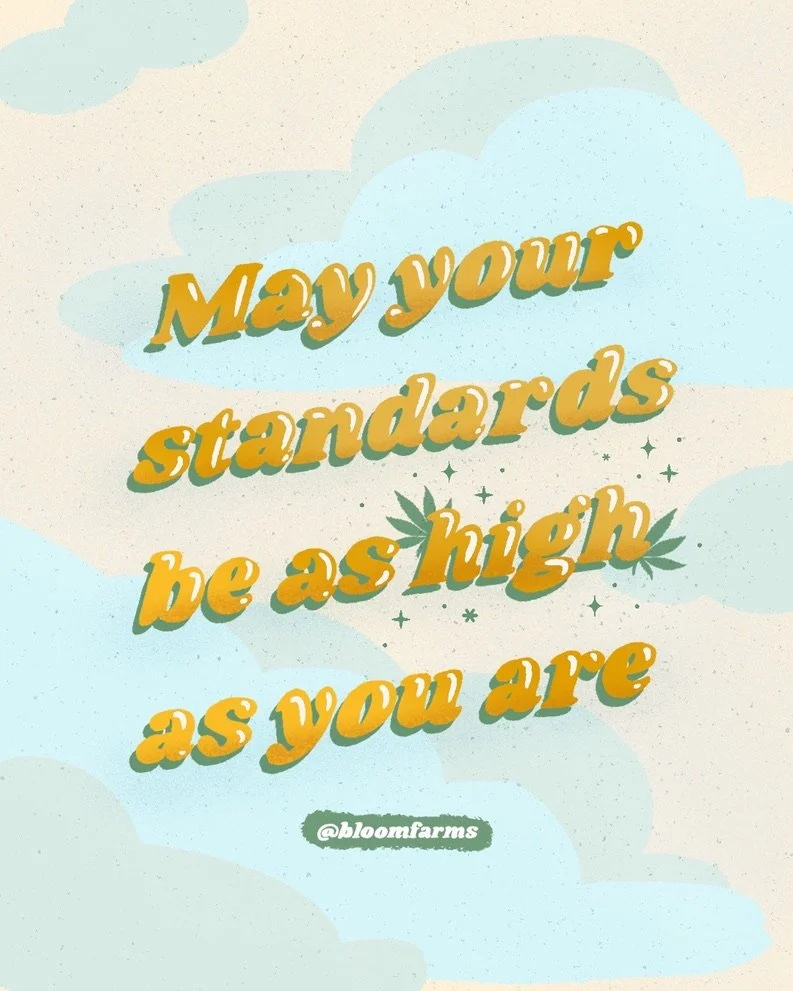
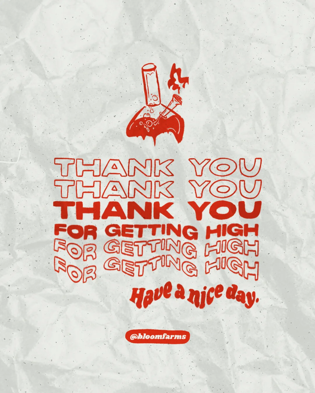
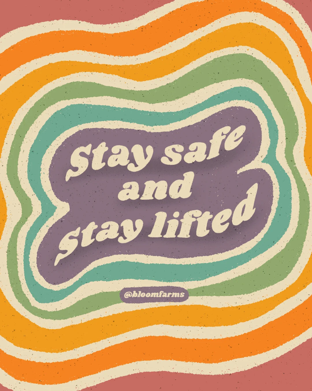
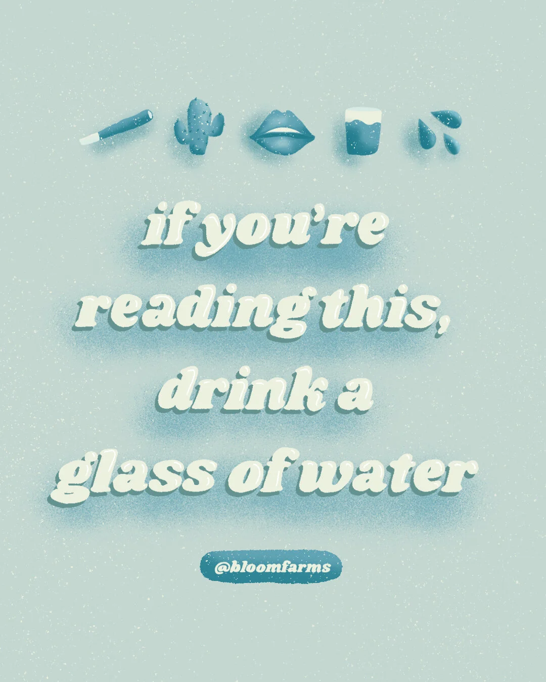
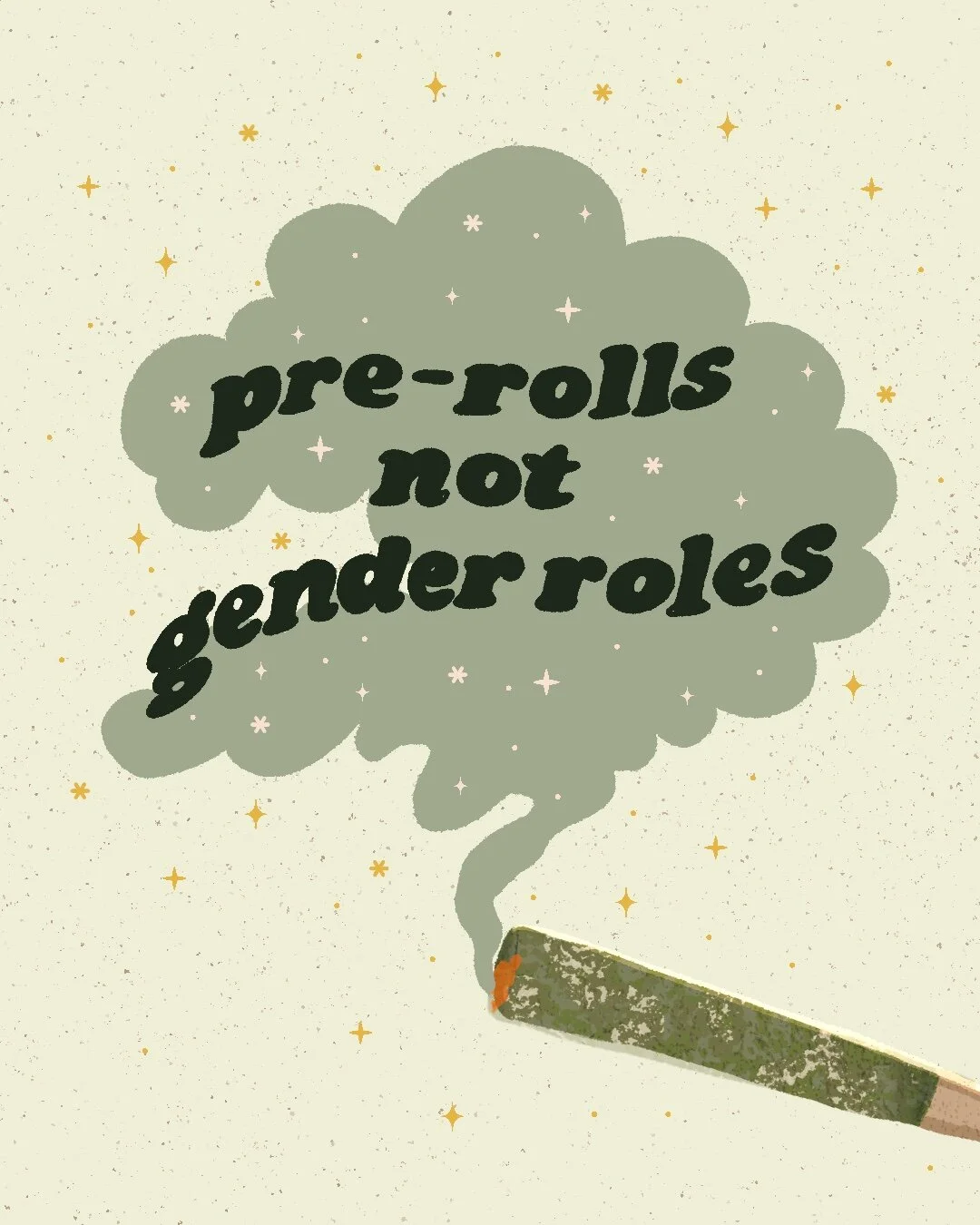
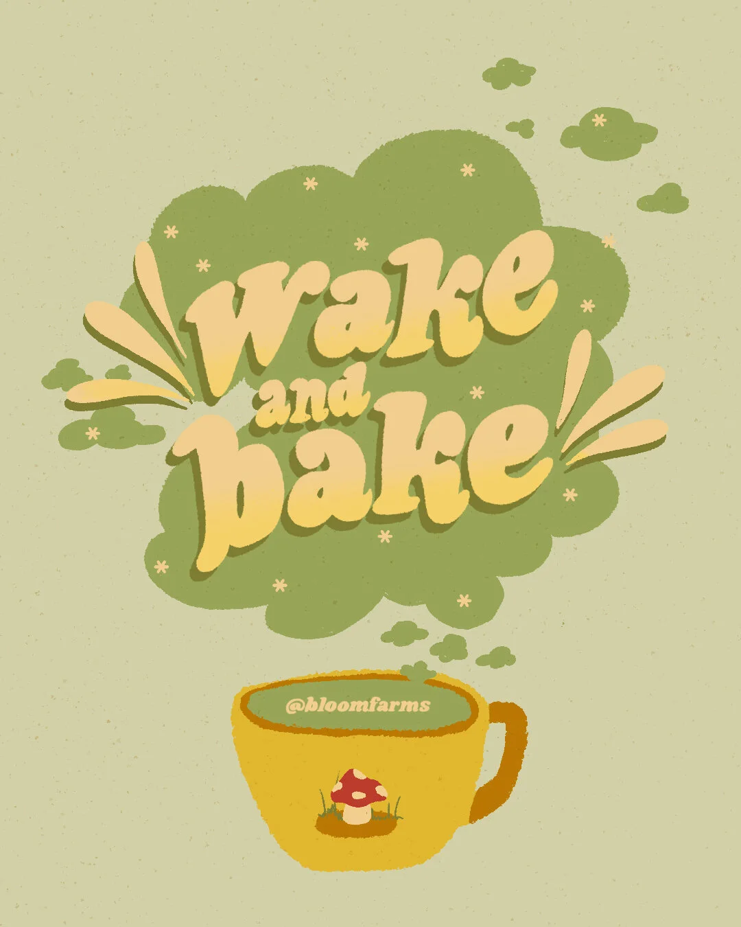
Typographic Illustrations and Social Posters
What began as a personal experiment quickly became a recurring social series. I started creating typographic illustrations in Procreate, often built around puns, reminders, or moments of humor that felt true to the brand.
The response was strong enough that these illustrations became a regular part of our social content, reinforcing Bloom Farms’ approachable and self-aware tone.


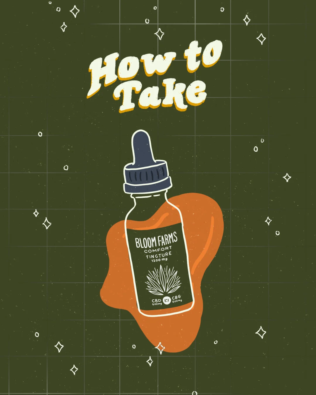
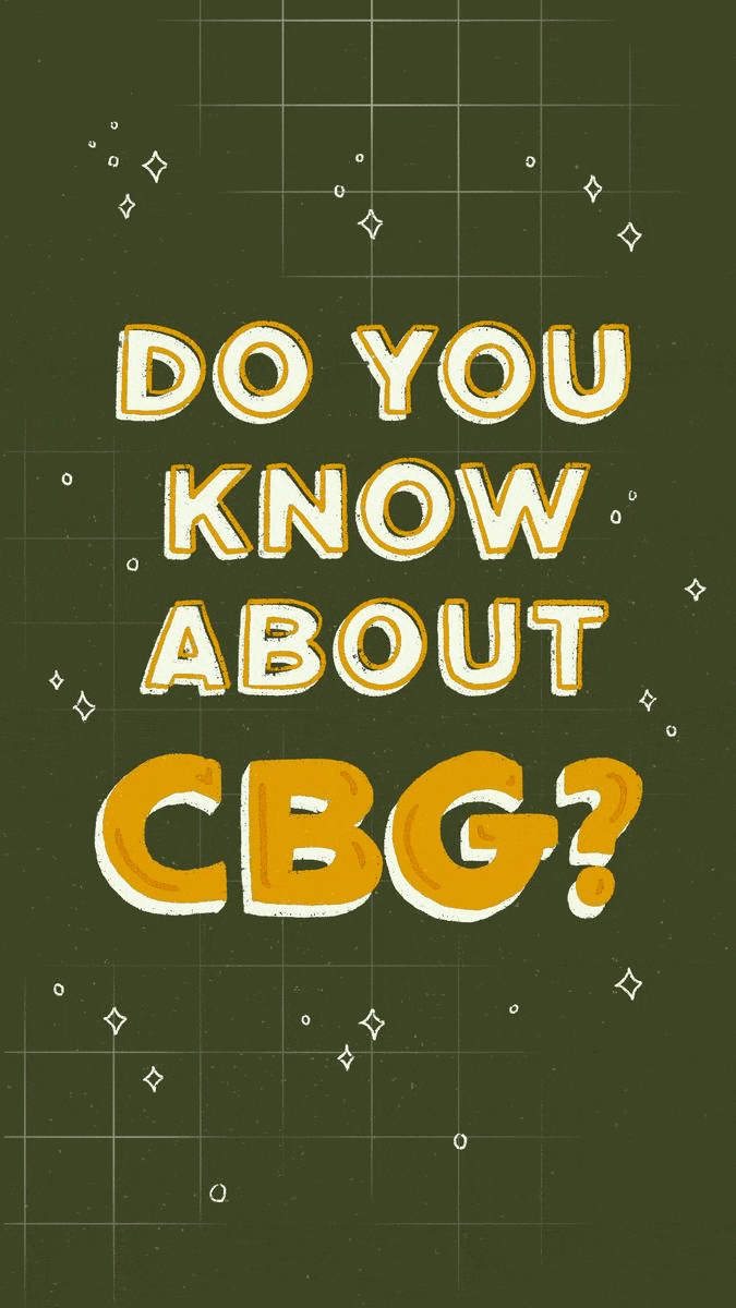
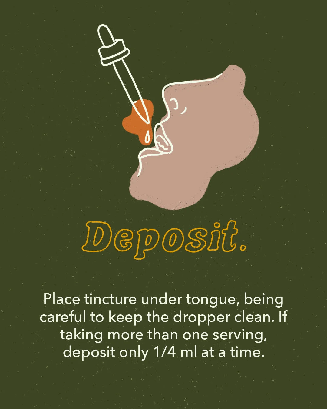
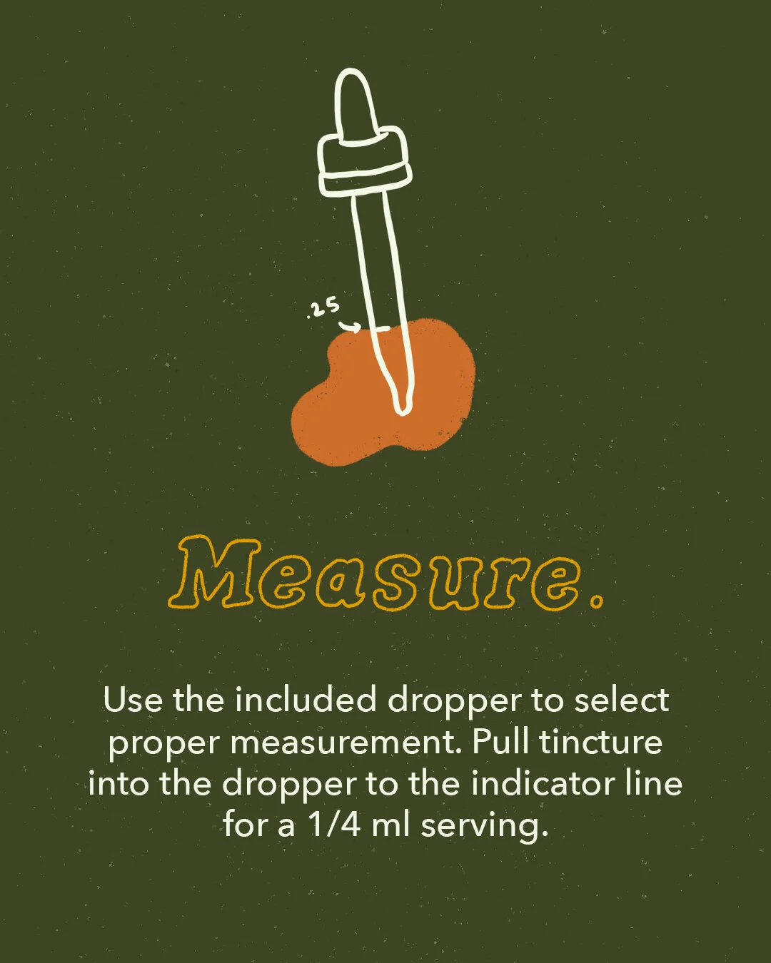
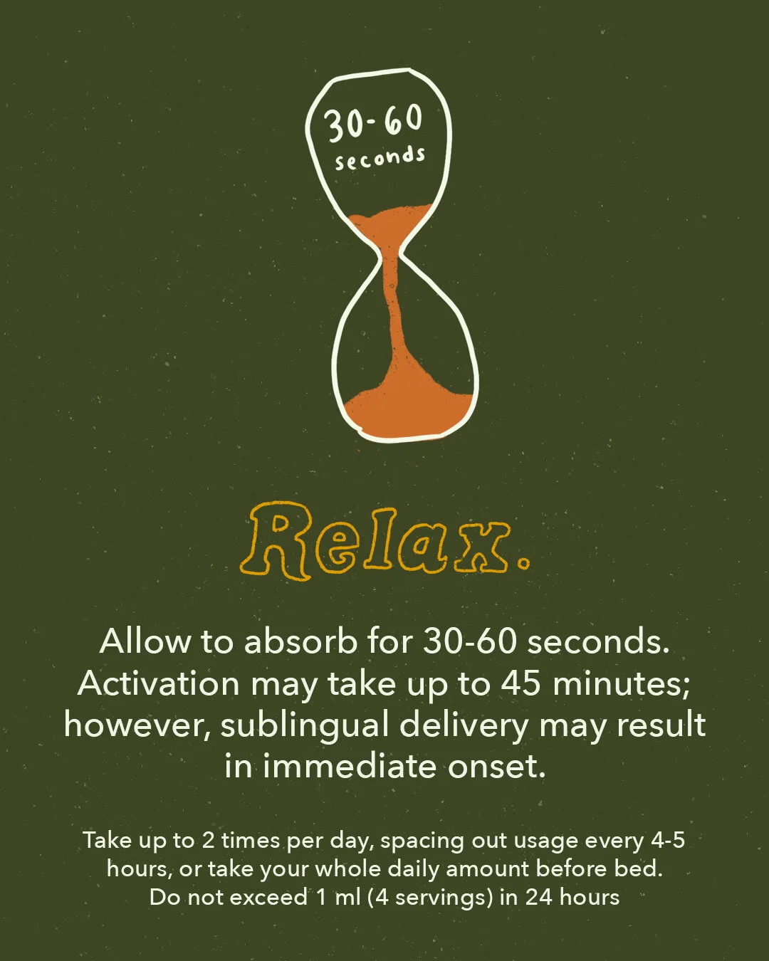
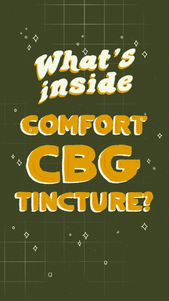
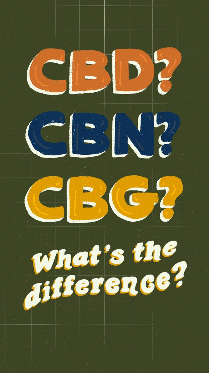
Illustrative Educational Social Posts
Education was a major focus for Bloom Farms, especially as new cannabinoids entered the market. I led the illustration and visual direction for a multi-part social series focused on CBG, breaking down what it is, how to use it, and how it compares to CBD and CBN.
The goal was to make complex information feel clear, friendly, and easy to engage with through visual storytelling.


Reflection
Bloom Farms gave me the opportunity to work in-house for the first time in a fast-changing industry. While much of the work included day-to-day design needs, this page focuses on the creative moments that shaped my growth as a brand designer.
It was a rare chance to experiment, learn quickly, and contribute to a brand that valued education, humor, and approachability.
☻
Oyster

Weber Shandwick

Playing around