OYSTER — CASE STUDY
Homepage
Refresh
PROJECT SNAPSHOT
ROLE
Senior Brand Designer
TIMELINE
3 months
FOCUS
Web design, brand systems, visual hierarchy, modular page design, cross-functional collaboration, dev handoff, QA
TEAM PARTNERS
Brand, Content, Product Marketing, Growth, Web/Development, Product, Leadership stakeholders
TOOLS
Figma, Adobe Creative Cloud, Webflow collaboration
SURFACE
Oyster homepage (desktop, mobile)
BROADER IMPACT
A clearer, more mature web expression and scalable patterns for future marketing pages and brand touchpoints
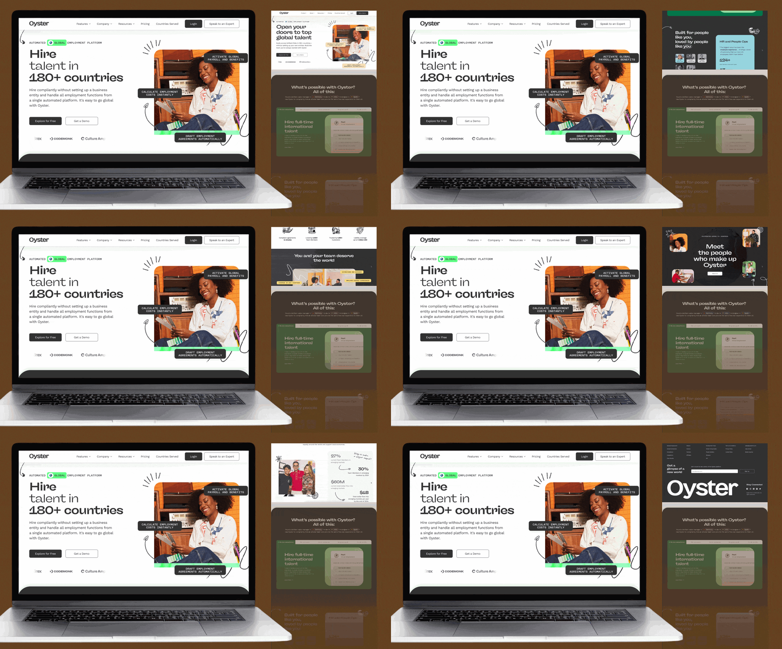
Designing, building, and scaling a web experience for a growing global brand
As Oyster grew from a startup into a more mature global employment platform, the homepage needed to do more than introduce the company. It needed to clarify a complex product story, communicate trust, support growth goals, and give the brand a stronger foundation for future web and campaign work.
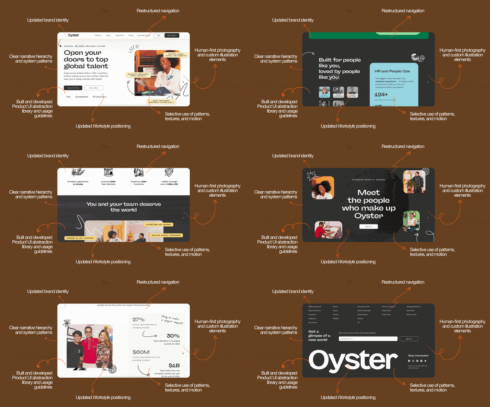
I led the design direction and execution for a homepage refresh that brought more structure, maturity, and scalability to one of Oyster’s most visible brand touchpoints.
The challenge
Oyster helps companies hire, pay, and support distributed teams around the world, which means the homepage had to explain a complex product in a way that felt clear, credible, and human.
At the time of the refresh, the brand was also evolving. Oyster needed to feel more mature and trustworthy without losing the warmth and people-centered quality that made the brand distinct.
The design challenge was not just making the page look better. It was creating a web experience that could hold a more mature brand story while staying clear, modular, and practical to implement.
What the page needed to balance:
Product clarity
Brand maturity
Trust-building
Conversion support
Scalable web patterns
A warm, human brand feeling
My role
I owned the design direction and execution for the homepage experience, from translating the brand direction into page structure and visual hierarchy to designing modular sections, refining the craft, and supporting handoff and QA.
I partnered closely with content, product marketing, growth, web/development, and leadership stakeholders to move the work from ambiguity to launch. My role was to keep the design clear and cohesive while balancing feedback, business needs, brand consistency, and implementation constraints.
I owned:
Homepage design direction
Page structure and content hierarchy
Modular section design
Visual system application
Brand maturity and polish
Cross-functional feedback synthesis
Developer handoff support
QA and implementation review
Approach
I approached the homepage as a scalable brand and web system, not a one-off page redesign.
The work centered on three design priorities grounded on my brand design principles:
1. Clarify the story
Create a page flow that made Oyster’s product and value easier to understand, especially for audiences who were new to global employment.
2. Build modularly
Design flexible sections and patterns that could support the homepage while giving the team reusable structures for future web and campaign needs.
3. Raise trust through craft
Use stronger hierarchy, intentional typography, cleaner layouts, and refined visual moments to help the brand feel more mature without becoming cold or generic.
Key design decisions
Clearer hierarchy
Because Oyster’s product was complex, the page needed to feel simple on the surface while supporting a deeper business story underneath. I focused on hierarchy, pacing, and clear content relationships so users could understand the offer without feeling overwhelmed.
Modular sections
The homepage needed to be polished for launch, but also practical for the team to keep building from. I designed flexible sections and layout patterns that could support future marketing pages and campaign needs.
Mature, credible, and still human
Oyster’s brand had a warm, people-centered quality that was important to preserve. A lot of the craft was in making the experience feel more mature and credible without losing that humanity.
Outcome
The homepage refresh became a key expression of Oyster’s broader brand evolution and helped establish a clearer, more mature web presence for the company.
The work gave the team a stronger foundation for future marketing pages, campaign moments, and web storytelling. It also helped define how Oyster could show up with more clarity and credibility while still feeling warm and human.
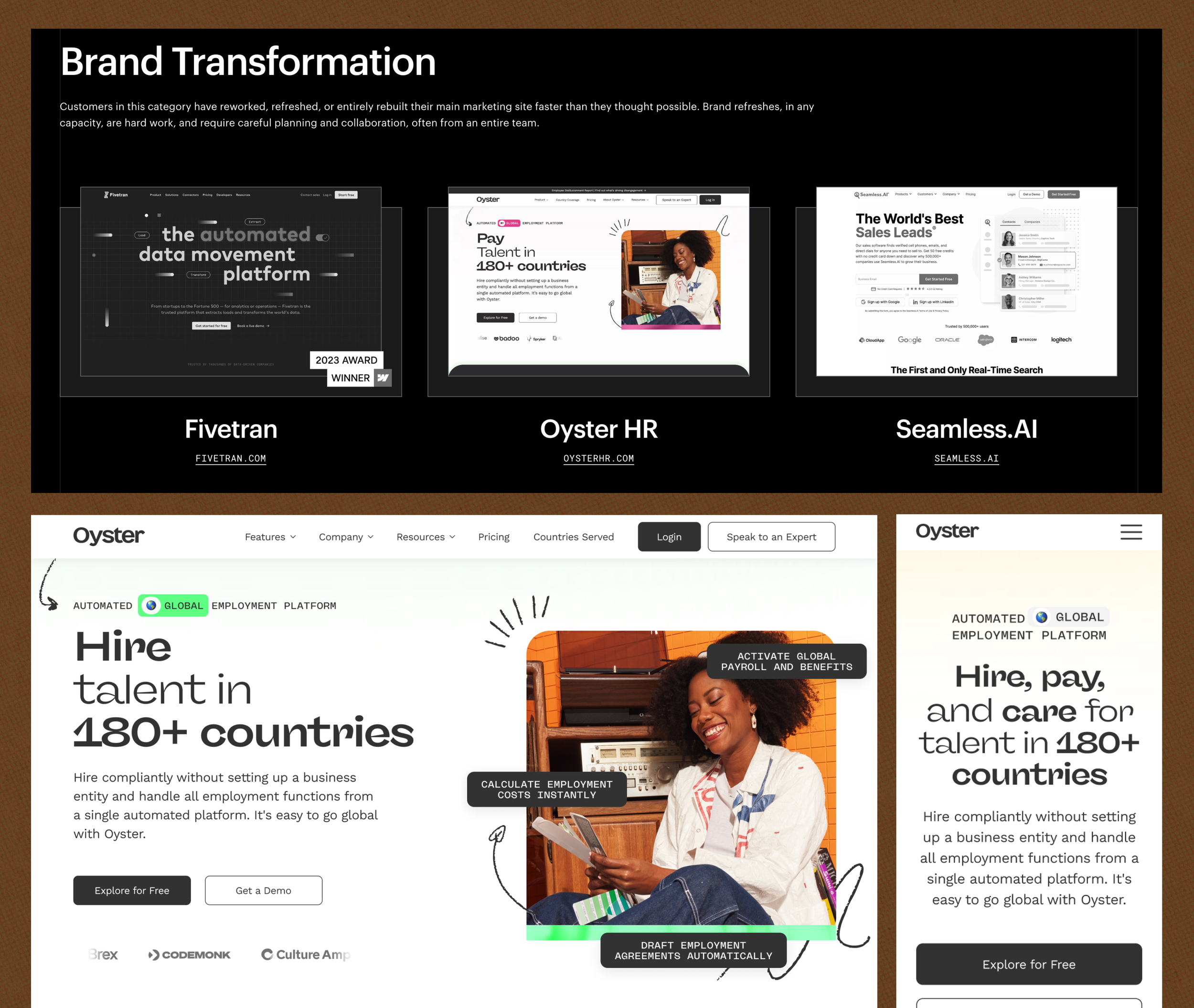
The first major homepage refresh was recognized as a Webflow Awards finalist in 2023, providing a meaningful external signal for the quality of the web experience.
✽ JUMP TO ✽